Blue and Cream Without a Coastal Theme
Quiet blue can feel at home with books, warm wood, and ordinary upholstery, without turning the room into a beach setting.
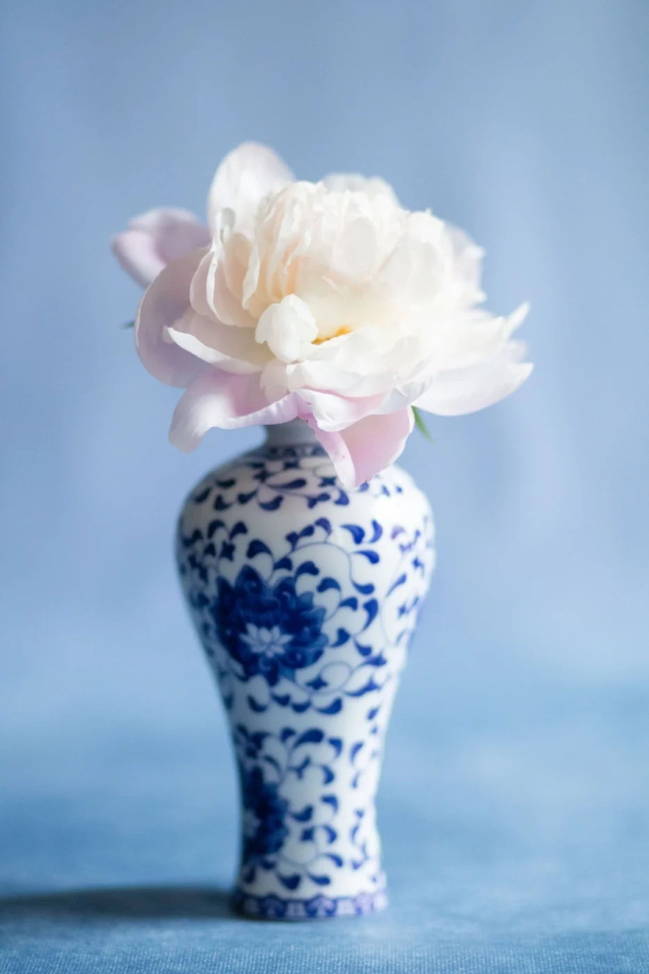
Blue and cream do not require shells, rope details, or a striped seaside motif. The combination can be as useful in an inland apartment as in a cottage near the water. Its character comes from the particular blues, the materials beside them, and the objects the room actually needs.
Begin with an existing blue object if possible. A faded rug, a ceramic bowl, or a patterned chair gives you something more specific than a color trend. Notice whether its blue is smoky, inky, or bright. Then bring a cream sample alongside it. Some creams soften the blue pleasantly; others make it look unexpectedly cold or green.
For a modest change, keep the largest furniture neutral and use blue in one area that needs definition. A blue lamp beside a cream chair can give that corner an identity. If a rug already contains several blues, a solid textile can pick up one of them without repeating the entire pattern. Matching every blue precisely tends to flatten the interesting differences.
Bring in a third material
Warm wood gives the palette another note without requiring another painted color. The wood might be a table, a frame, or the floor itself. Let its grain remain visible. A room where every piece has been painted cream may need the variation more than it needs another decorative accessory.
Metal and glass can also prevent the palette from becoming overly soft. A plain metal reading lamp or a clear glass vessel provides a different surface. Choose these for their usefulness and shape; they do not all need to become statement pieces. The blue and cream should leave room for ordinary belongings.
Pattern is optional. If you like it, decide whether the pattern or the blue color is meant to lead. A large floral in blue and cream has a strong presence even with only two colors. Nearby cushions can be quieter, with a smaller repeat or a nearly solid weave. Putting several equally assertive prints together can make a calm palette feel surprisingly busy.
Look at the finished arrangement from the doorway. If it reads as a theme, remove the objects that spell out the theme most literally and keep the useful pieces. A worn blue cushion, cream curtains, and a wooden table can carry the whole idea. There is no need for an object that announces where the room is supposed to transport you.