A Little Dusty Pink in a Neutral Room
Dusty pink works best when it has something substantial to sit beside, rather than a crowd of equally sweet accessories.
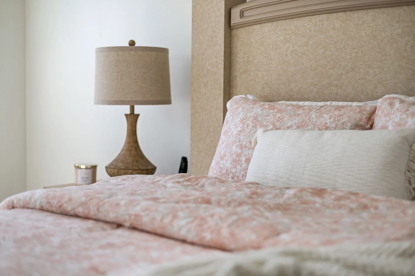
A dusty pink cushion can be a useful bridge between cream upholstery and reddish wood. It can also look oddly sugary if everything nearby is pale, glossy, and delicate. The color is not the whole decision. Weight, finish, and proportion determine how it behaves.
Try pink first in something easy to move. A textile, a small piece of art, or a vase lets you see whether the shade belongs in the room without committing to a painted wall. Leave it beside the furniture through a normal day. A color that seems subdued in morning light may become the brightest object in the room after the lamps are on.
Pink with a brown or gray cast often sits comfortably with earthy materials, but the label on the product is less useful than the actual comparison. Put the sample beside the floor and the largest fabric. If it looks separate from everything else, try a different depth before deciding the room cannot use pink at all.
A dark wooden frame, a plain woven rug, or a substantial ceramic bowl can make a pink accent feel less fragile. The companion does not need to be masculine or severe. It simply needs enough visual weight to keep the arrangement from becoming a collection of delicate details.
For example, a dusty pink throw over a clean-lined brown chair creates a clear contrast in both color and material. Add a pink candle, pink flowers, pink book covers, and a pink tray, and the original relationship becomes harder to see. Repetition is helpful only until the color feels established.
If you want a larger pink element, such as curtains, keep the surrounding decisions straightforward. A complicated window treatment can make a soft color more decorative than intended. A simple panel allows the fabric and its changing light to be the point. Consider how it looks closed as well as gathered at the side.
There is no requirement to repeat the accent in every corner. One pink area may be enough, particularly if it connects with a small note in an existing rug or painting. Let the rest of the room contain things chosen for other reasons. A color tends to feel more natural when it lives among useful, imperfectly coordinated belongings rather than being responsible for the entire decorating scheme.